Core Design System


About Core
Core is a comprehensive and user-friendly design system
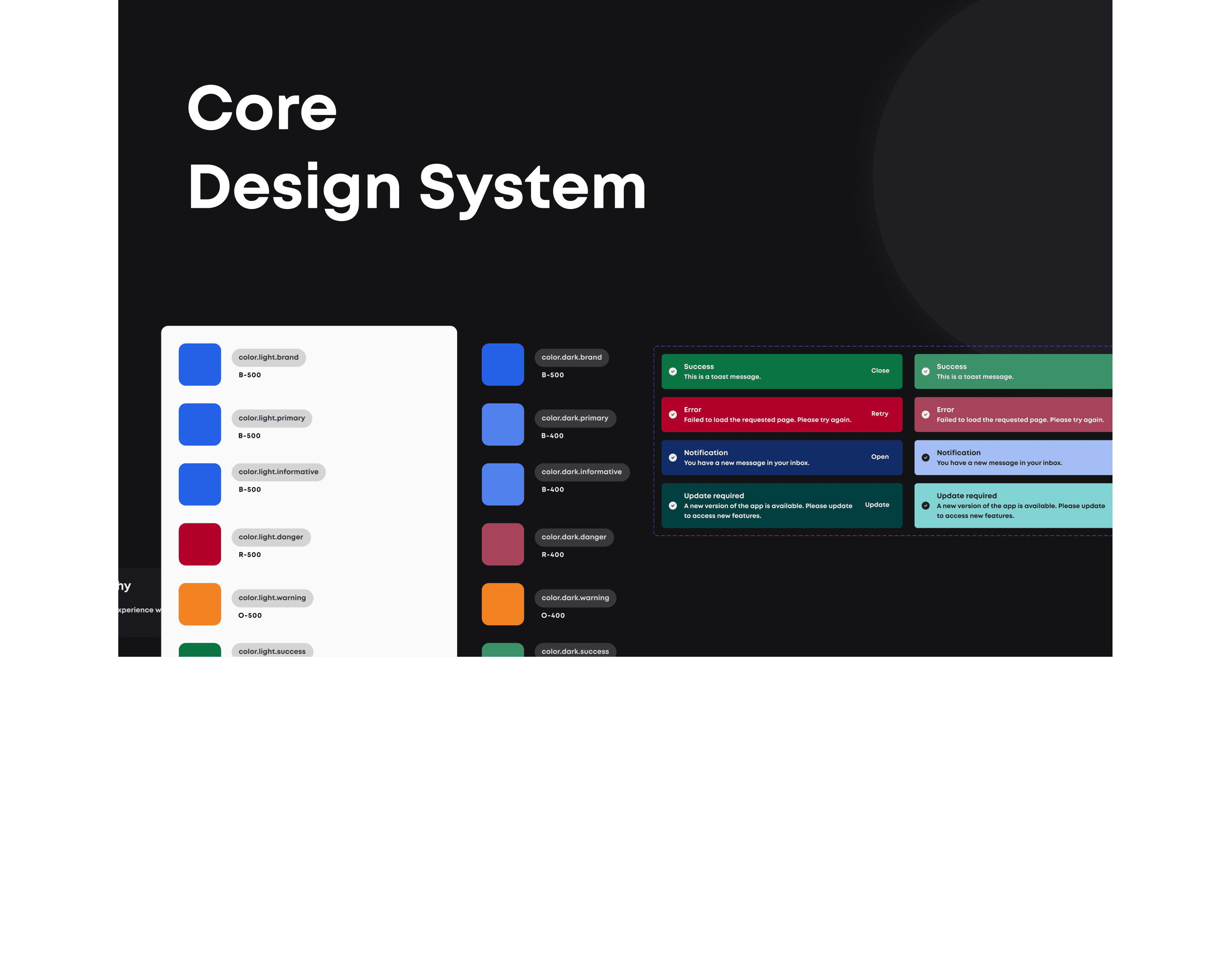
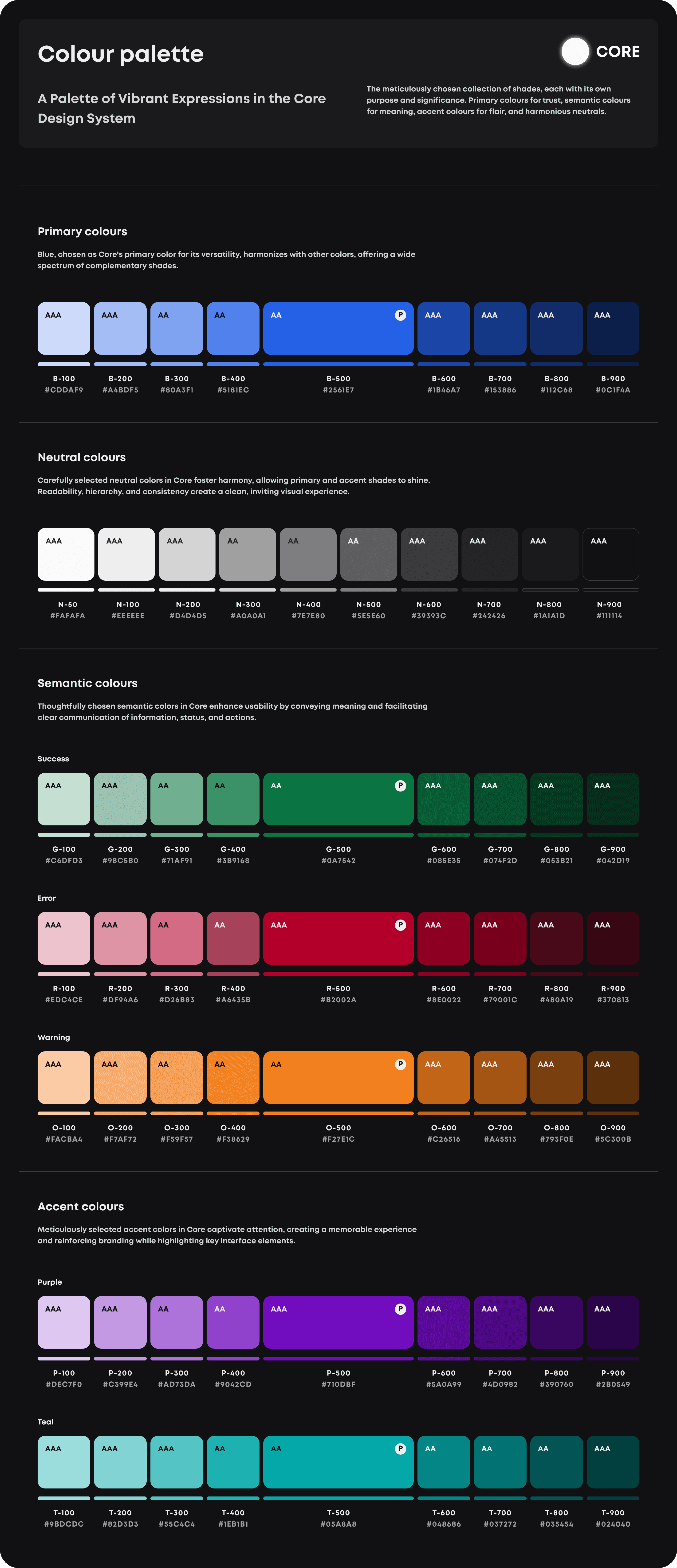
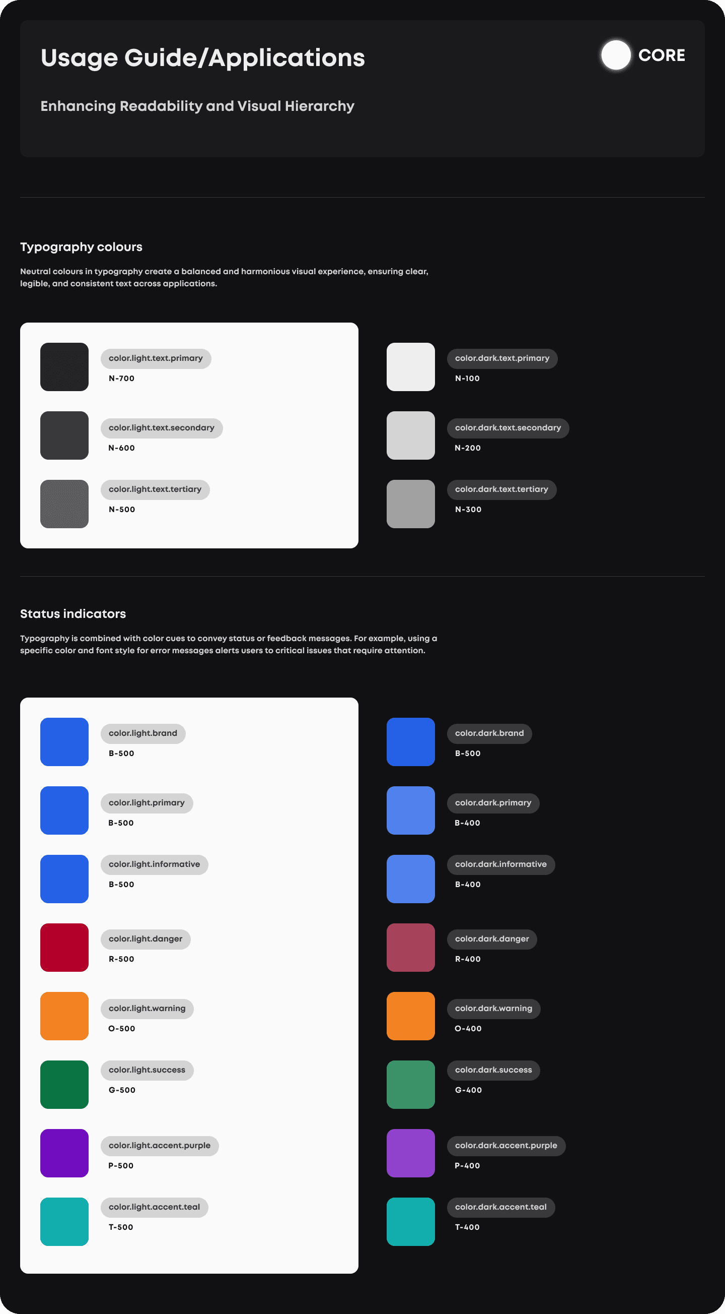
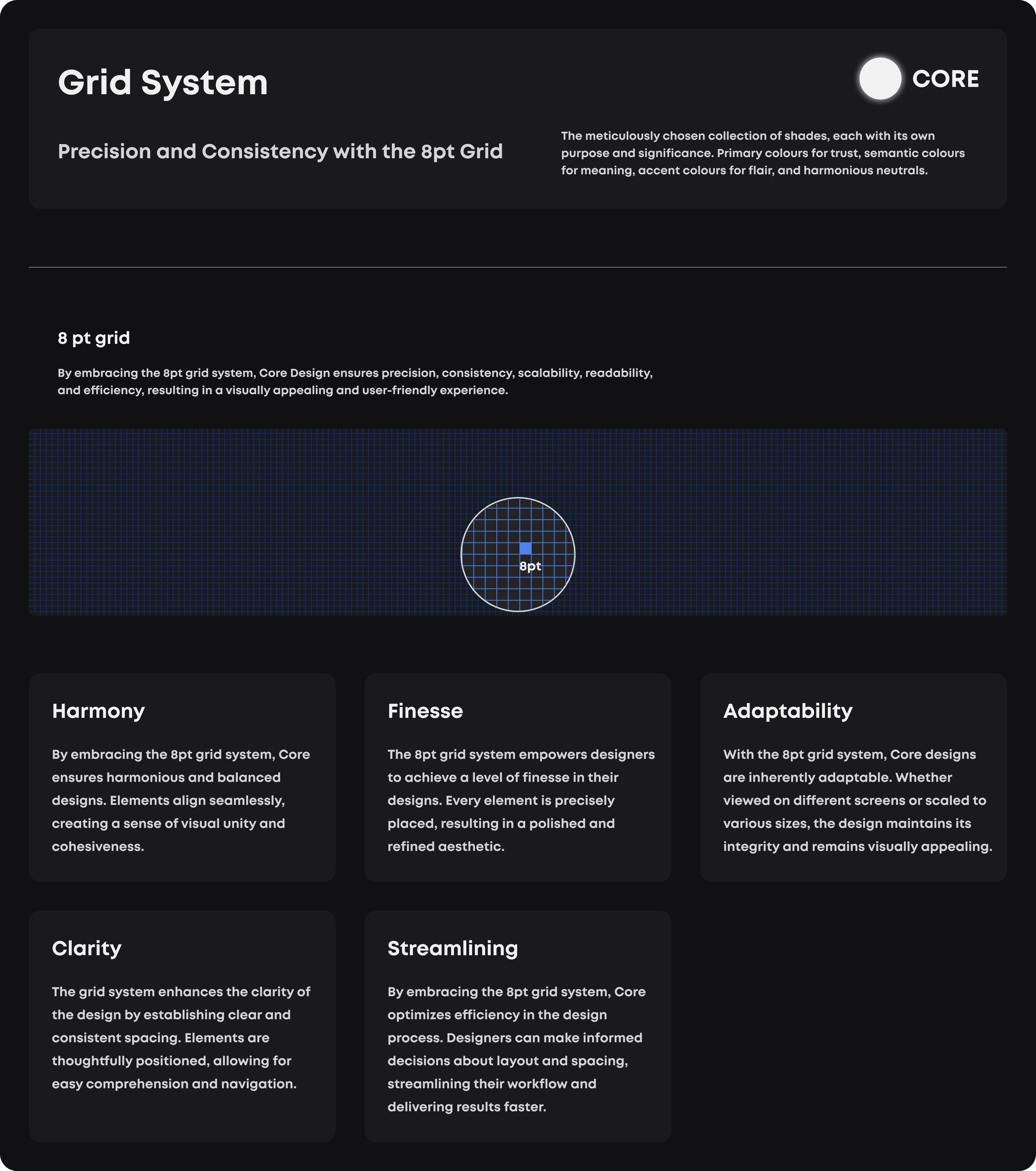
Core prioritizes clean and minimal design principles with fixed maximum width and consistent spacing guidelines. It covers various components, such as tooltips, modals, buttons, overlays, and more, ensuring a cohesive and visually pleasing user experience.
Why use Core?
Use Core for cohesive, efficient, and user-centric design. It offers pre-defined components, guidelines, and accessibility best practices, saving time and promoting collaboration.
Consistency
Core ensures uniformity in design elements and components across the interface, creating a cohesive user experience. It establishes a visual harmony that reinforces brand identity and user familiarity.
Efficiency
With predefined components and guidelines, designers can work faster and make informed decisions, reducing design iteration time. The system streamlines workflows, boosting productivity and collaboration.
Time-saving
Core's pre-built elements save designers from reinventing the wheel, allowing them to focus on refining designs and addressing specific user needs more effectively.
User-Centered Design
Core emphasizes user needs and accessibility, guiding designers to create intuitive interfaces that cater to diverse user requirements and preferences.
Accessibility
Core integrates accessibility principles, equipping designers to craft inclusive designs that meet the needs of all users, regardless of their abilities.
Scalability
Core's flexible components adapt seamlessly to various screen sizes and devices, supporting responsive design and ensuring consistent user experiences across platforms.

